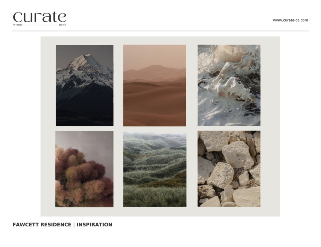
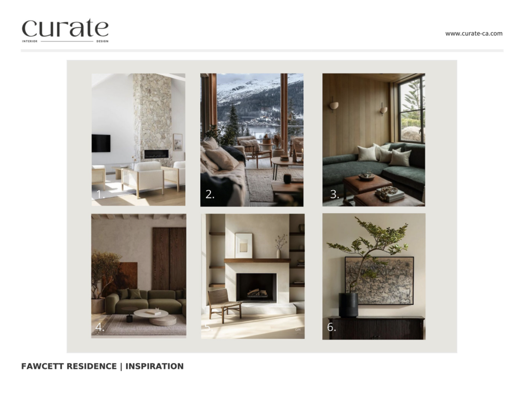
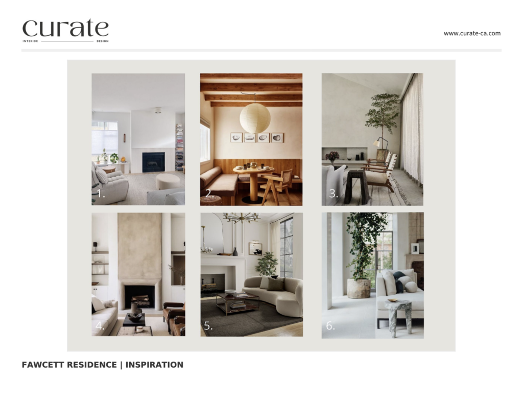
This project has ground breaking before’s and after’s but to put it humbly, it could be because the staging was a bit scary. This home is a 2 level town home and the client wanted it to feel contemporary, cozy, minimalist, a little bit “cabin-ey” and to include little details that honours her main passion of rock climbing. It was nice to have that as a request because this gave us something to build a concept around. I chose a neutral colour palette with creams, browns, earthy greens and some touches of rust. This allows for the space to feel serene, grounding and relaxing, just as it would out on the mountains.
Below I share how I got started with this project, formed a concept and creative direction and executed the design using floor plans, design boards and photographic renderings.
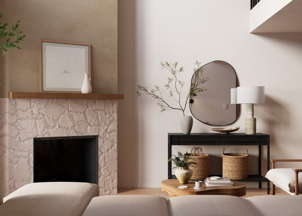
We included lots of different textures to add interest and depth to the space. Stone, soft fabrics, rugs with visual texture, solid tones accented by some subtle patterns, greenery wherever possible, soft lighting to promote relaxation and artwork that honoured the concept without being too literal.
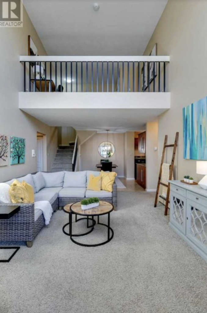
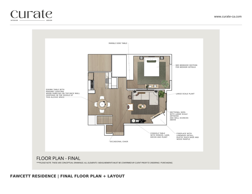
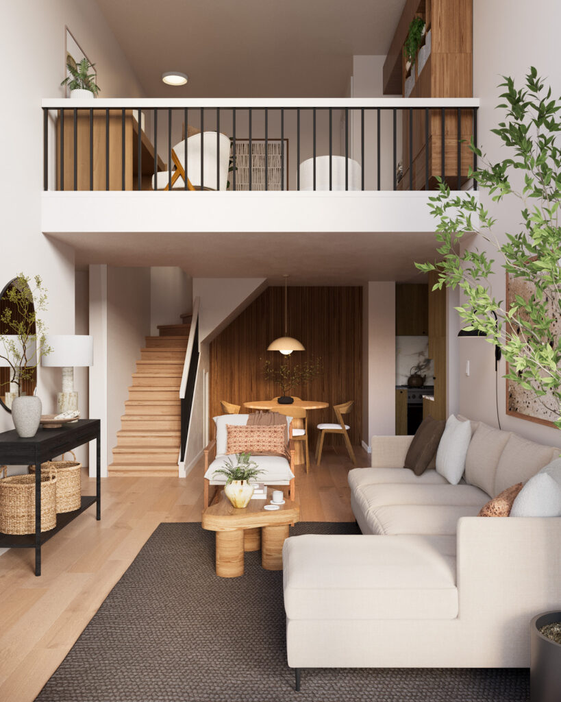
The Living Room / Dining Room
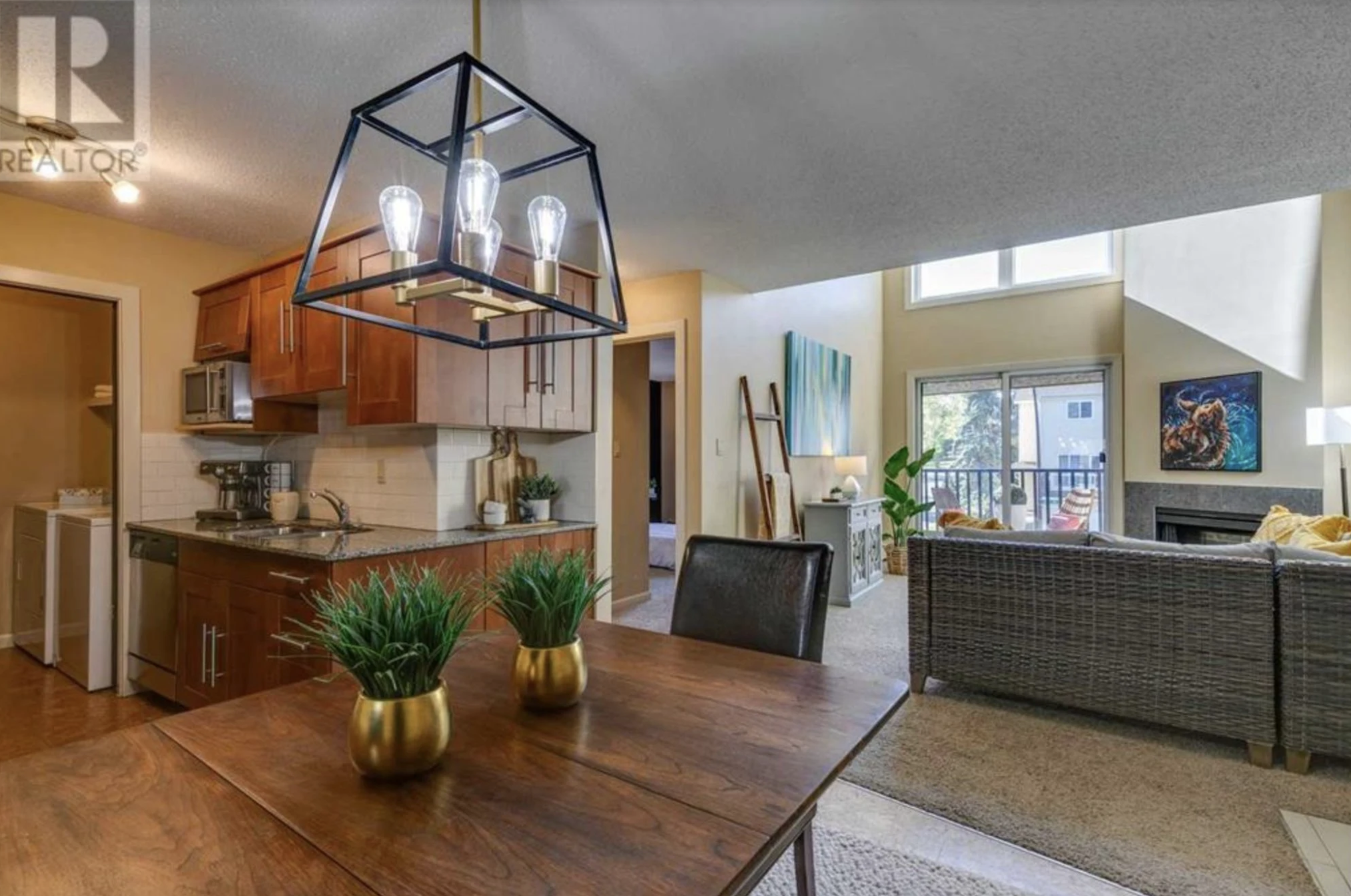
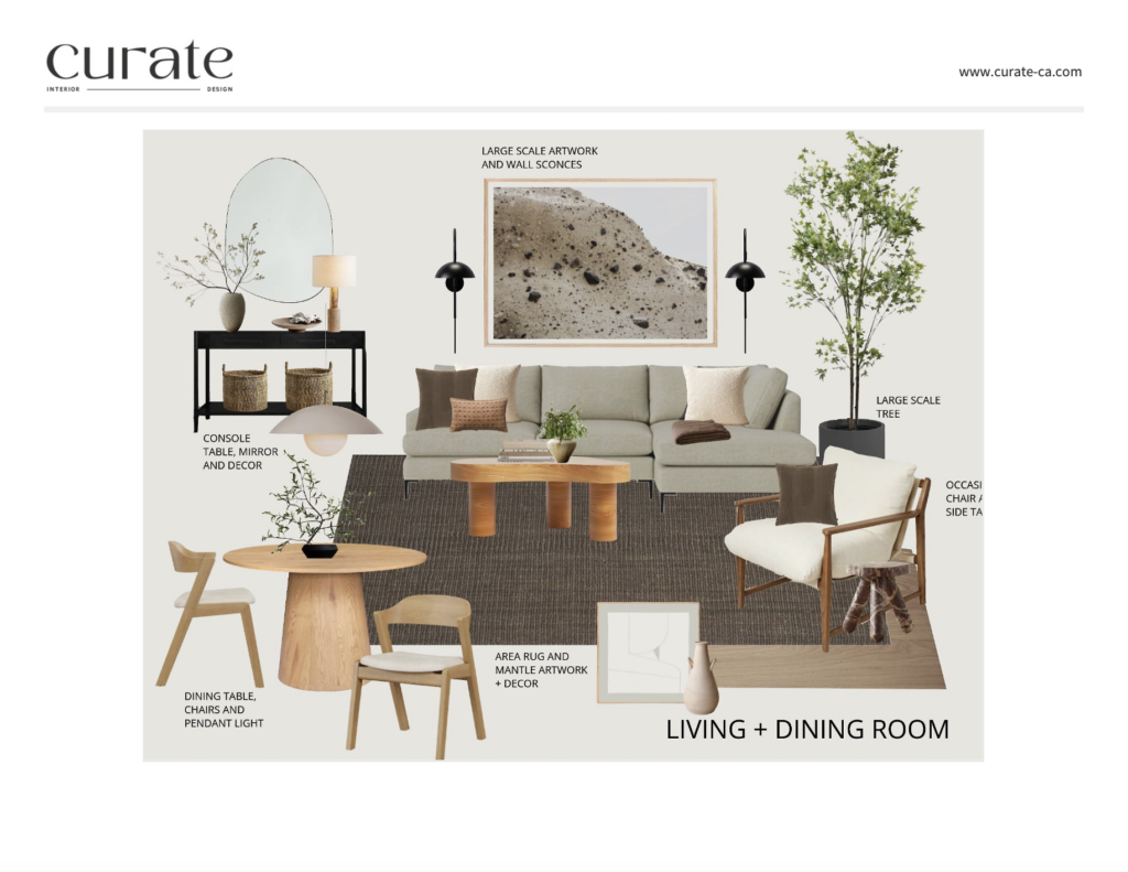
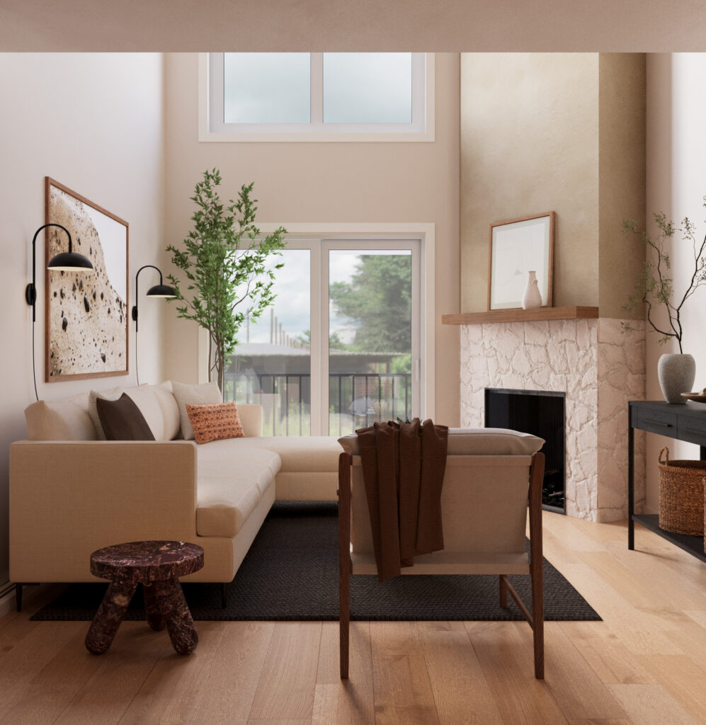
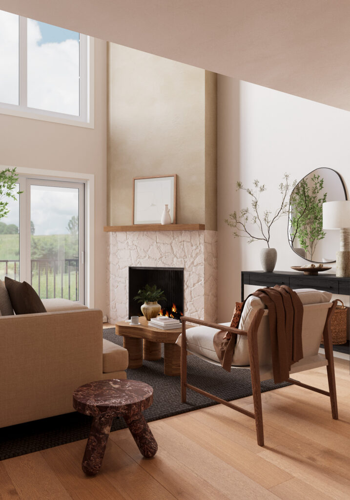
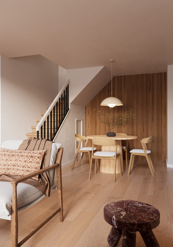
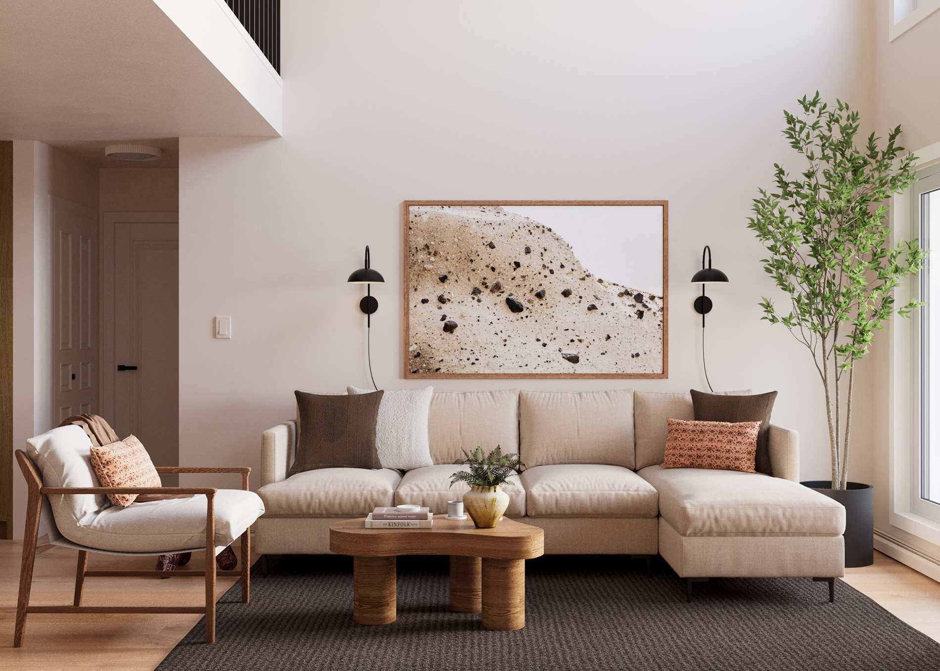
The client wanted the space to feel reminiscent of a cabin in the woods while also feeling a little more minimal and contemporary. To achieve this, we painted the walls in a crisp, fresh yet warm white, added in some stone detailing, panelled some of the walls in wood and accented each room with a similar colour palette that honours the colours we see in nature.Including larger scale plants in the design is another way we achieved a more cabin-like aesthetic, cushions, throw blankets and inviting fabrics helped as well. Living Room BeforeDining Room BeforeThe layout for this space was a little bit tricky because there is a large angled wall that is actually a fireplace. When you have an angled wall, in most cases you wanted to design as if it isn’t angled. We don’t want to angle the furniture around it, just act like it is a regular 90 degree corner. BUT because it was there is made the sofa decision a little tricky as the room was less wide towards that side of the room. You will notice in one of the before photos, the stager decided to arrange the room in the opposite direction as I did. This is okay but I felt placing the sofa on the larger wall allowed for us to create more of a focal point as you enter the space from the front door. As for the dining room, choosing a round dining table as oppose to a rectangular one, like you see in the before photo, allows for better circulation in a smaller space. The furniture chosen is relatively all contemporary in style with the goal also to be warm and inviting. We did a mix of wood tones, soft, timeless and neutral fabrics that represent our concept of being in the mountains and architectural lighting to make the space feel thoughtful and elevated. Lighting a great way to make a space feel more detailed and elevated. We did a mix of high and low with the budget. Good quality sofa with more economical arm chair. Lower end dining table with higher price tag dining chairs. Some other details that elevate the space and make it feel special is the burgandy marble side table, the oversized plant and the architectural, scandinavian lighting. Main feature wall with neutral sectional, textured area rug, architectural coffee table, mid century occasional chair, archival/gallery quality photographic print, oversized indoor tree, elevated wall sconces and minimalist decorative touches.
One of my favourite things when it comes to styling is ensuring the plants aren’t too small for the space. When a floral arrangement or plant is too small, it looses its intention and it draws more attention than it should when the true purpose is for it to make the space glow. That is actually the case with almost all pieces in a design, if something isn’t quite right, it kind of messes up the whole feel. BUT plants and flowers are more important than they might seem. I am also in love with the paneling in the Dining Room. It makes that little nook feel extra special and draws us back into the original concept of the whole design – minimalist, contemporary, cabin.
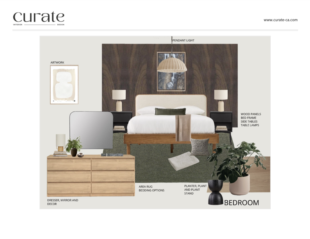
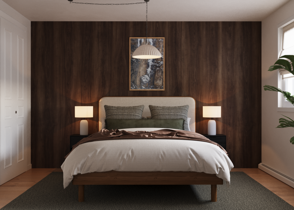
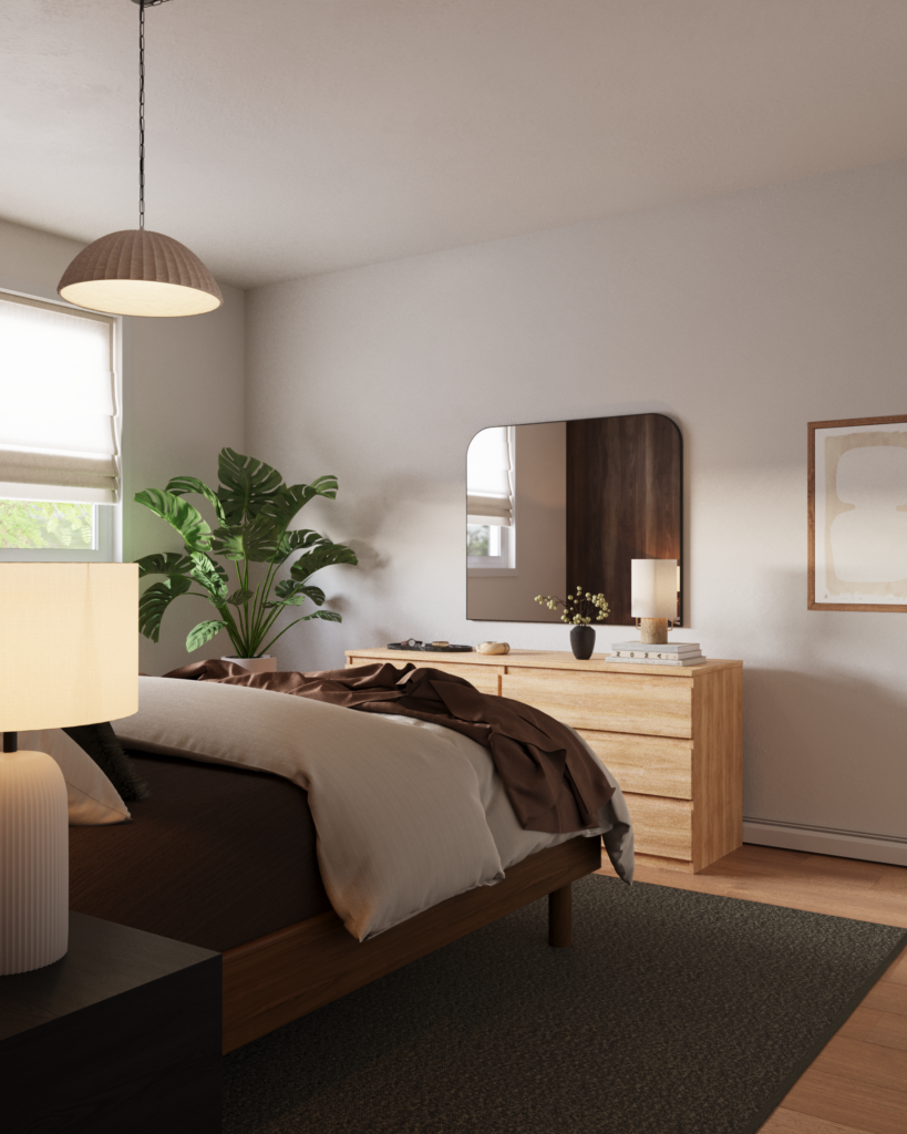
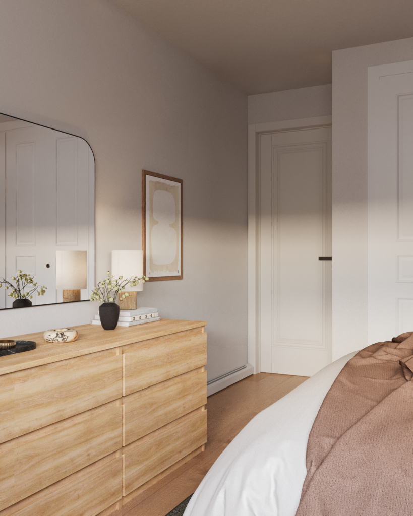
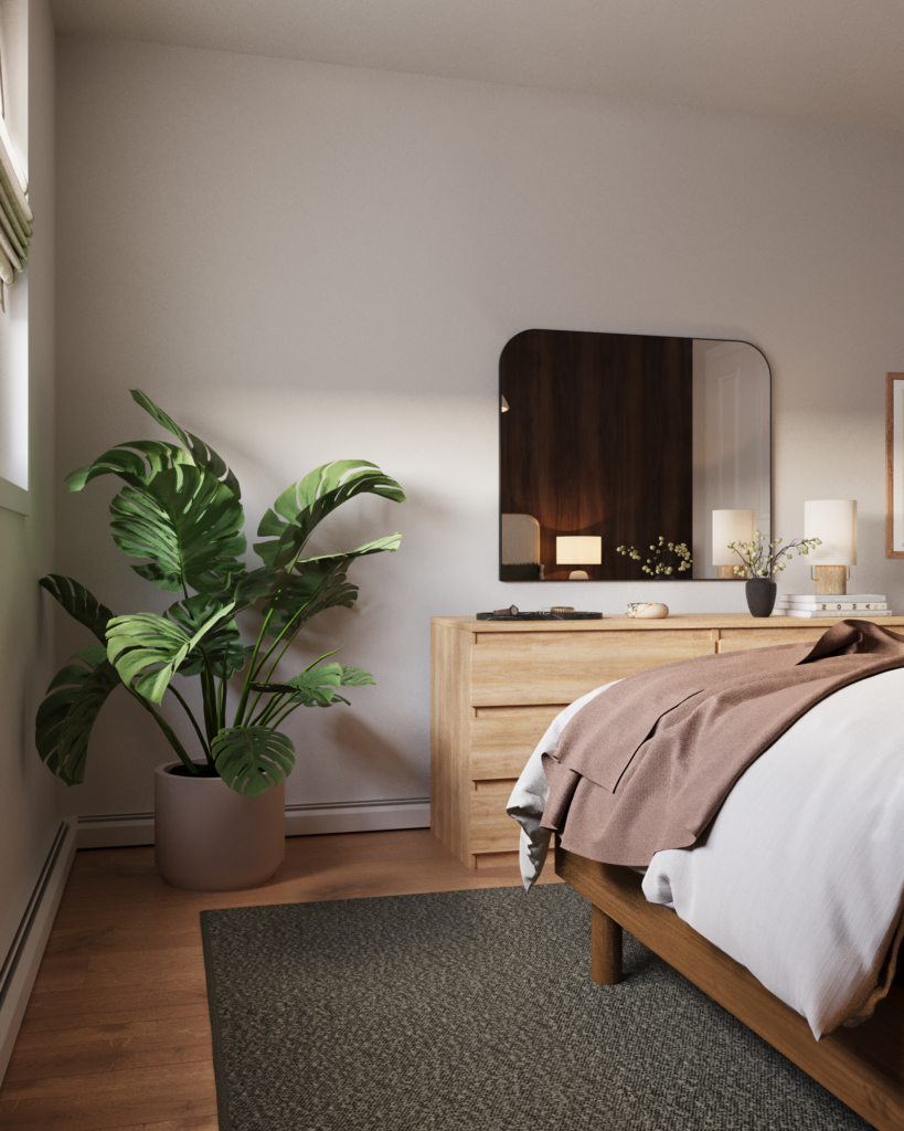
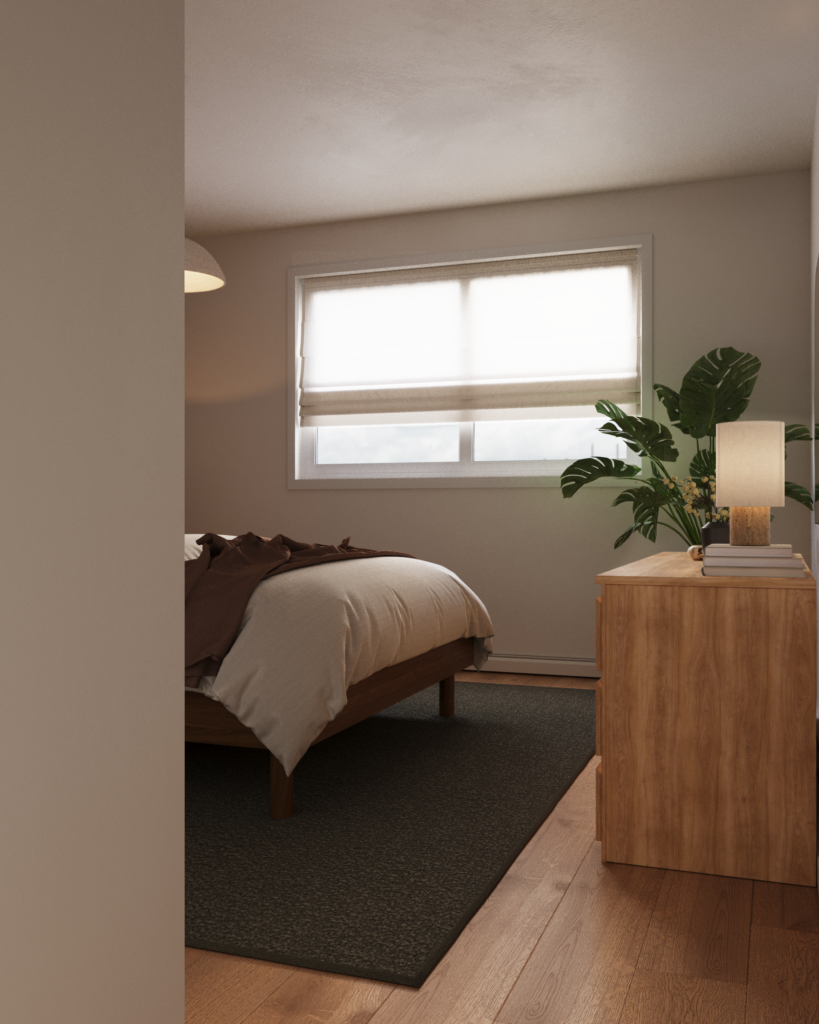
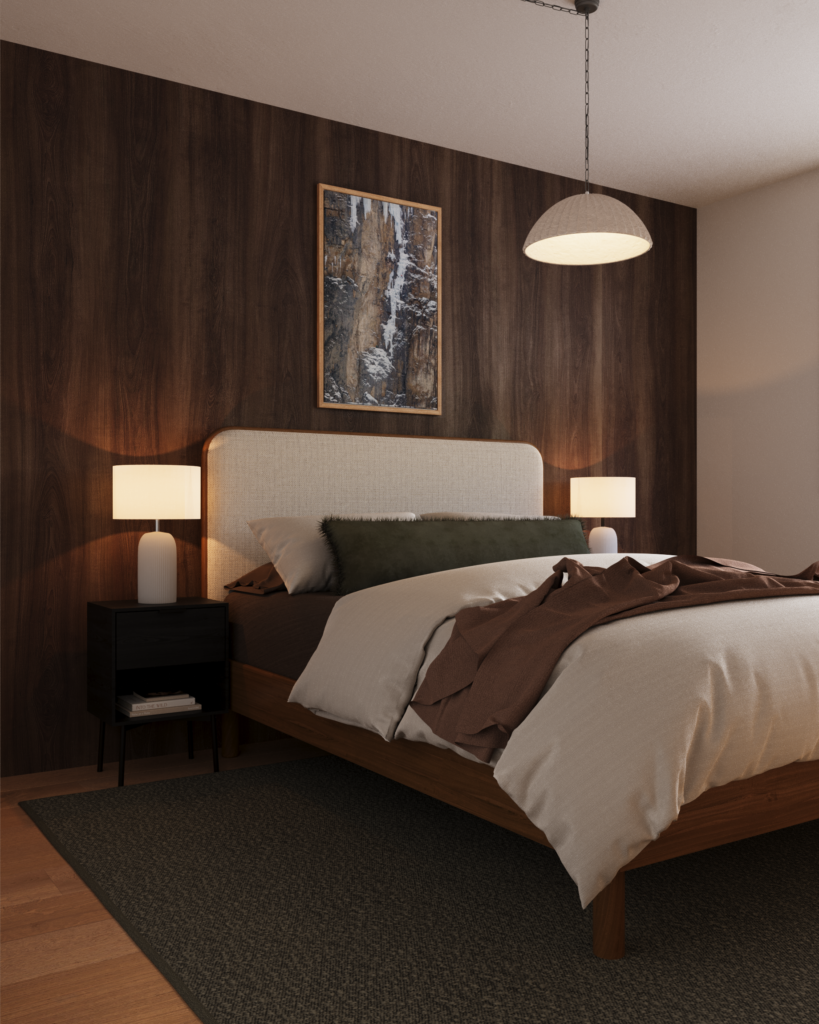
The Master Bedroom
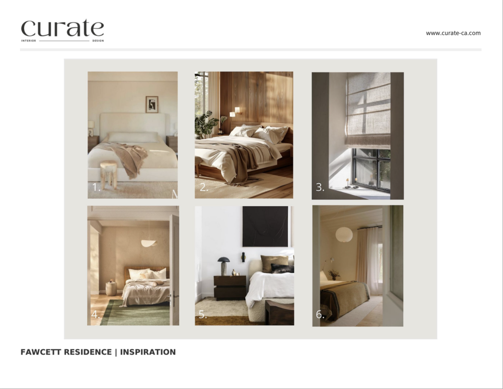
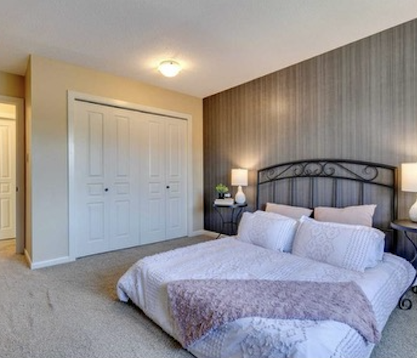
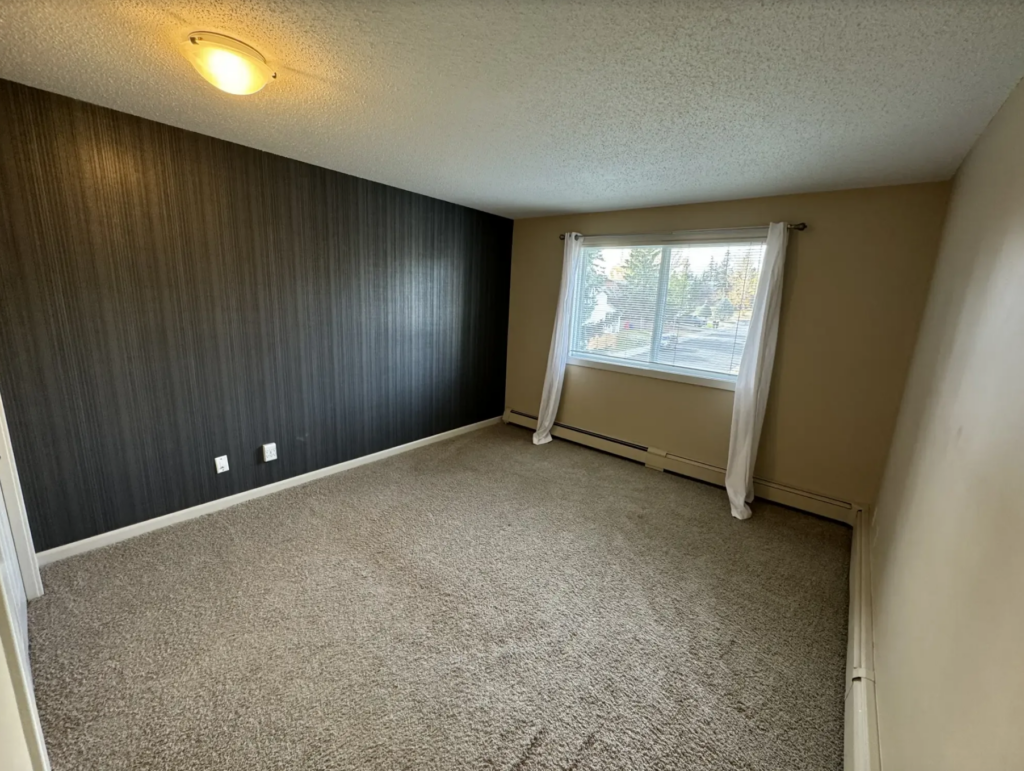
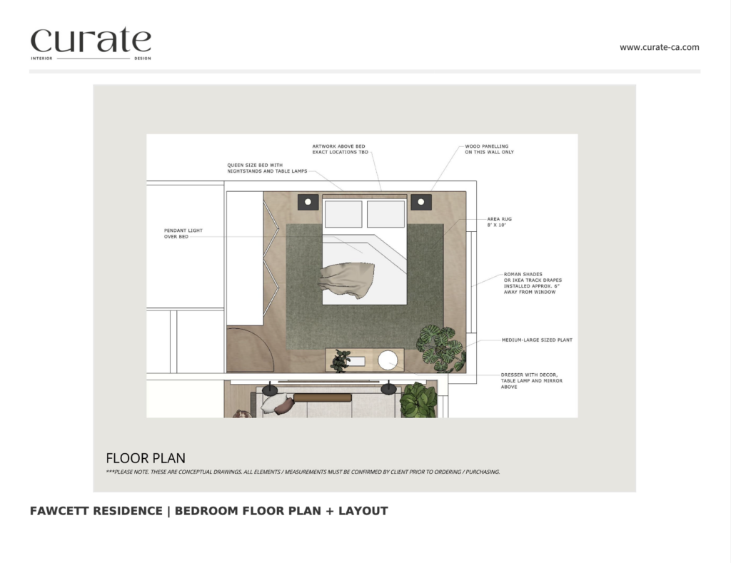
Throughout the whole house we kept the same colour palette. When you do this you create a strong sense of cohesion and the whole house feels incredibly relaxing. Humans loves repetition, so when details like colour palette and other design touches are repeated in each space it creates harmony and relaxes our nervous system. Bedroom BeforeBedroom BeforeThe floor plan for the bedroom was pretty straight forward. This layout allows for ample circulation around the bed, space for a dresser and room to move around the closet. It is optimal because the bed isn’t in the direct sight line of the door which provides a bit more privacy. Specifically in the bedroom we focused on introducing linen fabrics, soft lighting, a couple different wood tones and some black. The wood wall behind the bed frame anchors the room and connects us with the cabin aesthetics we were striving for with the concept. The green rug under the bed is also a feature as it introduces some colour to the space without being too overbearing. The print behind the headboard is shot by a local climber in Calgary, Alberta and also connects strongly with the client’s favourite hobby.
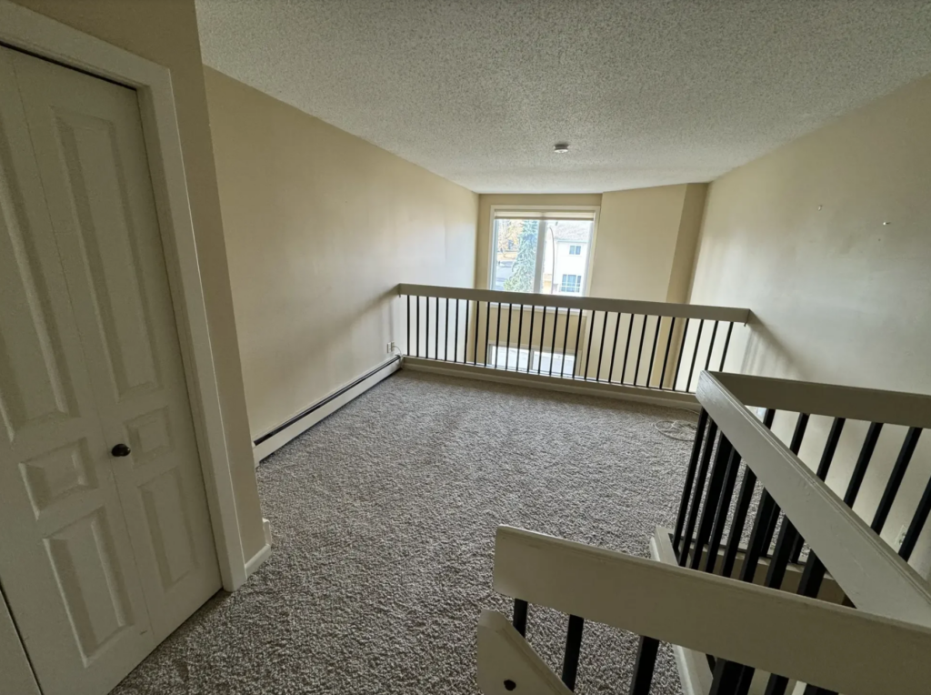
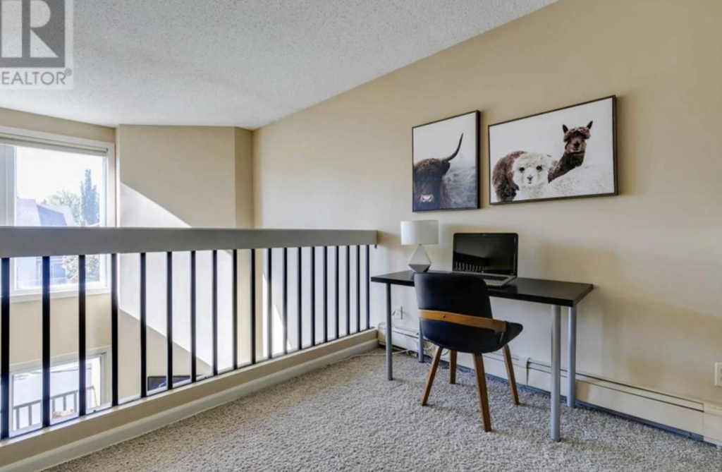
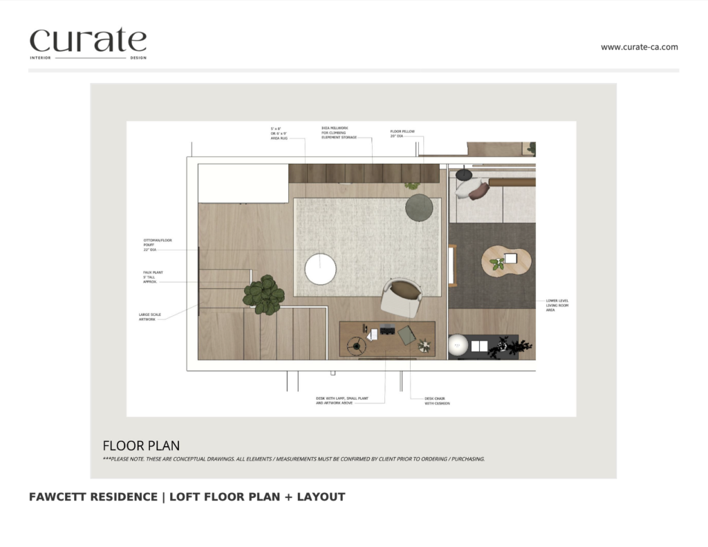
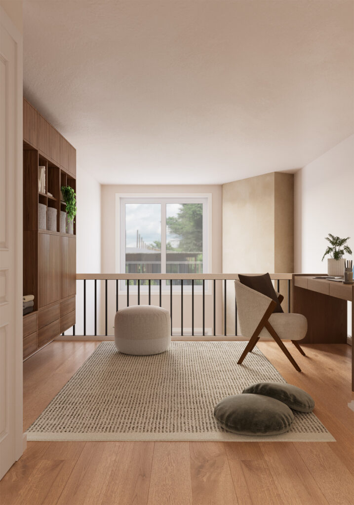
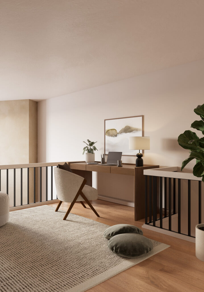
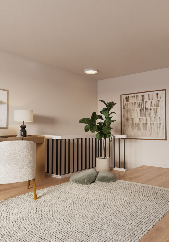
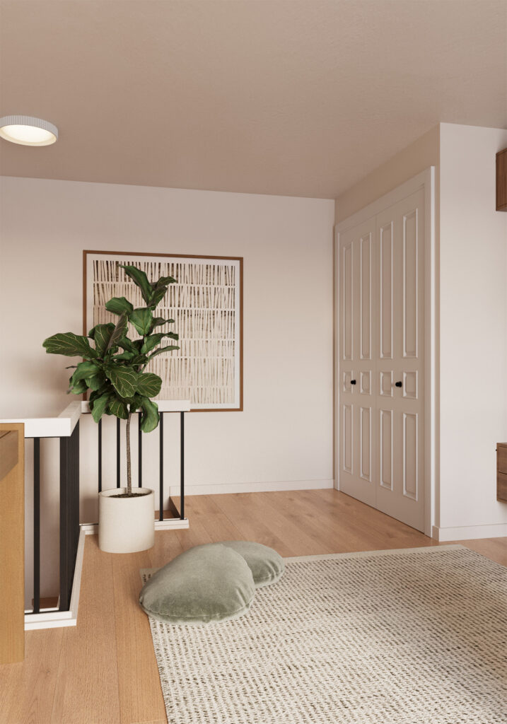
The Loft / Office
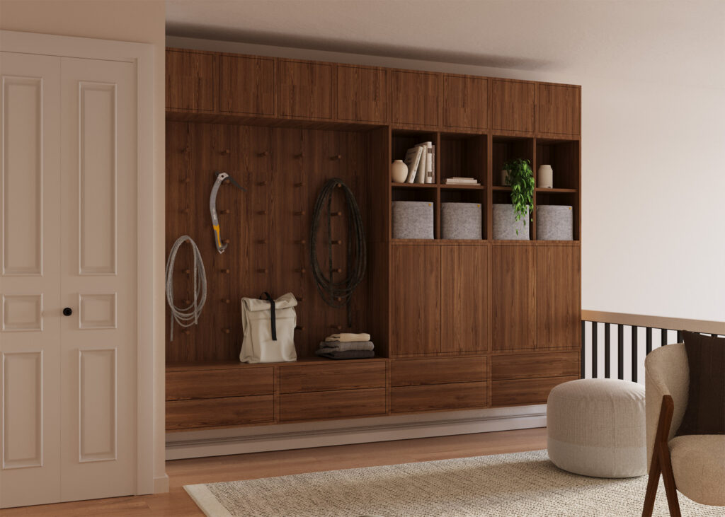
The Loft was the last room we worked on, so at this point the concept was easy to nail and this space had strong intention as the client wanted it to function as storage for her rock climbing gear but also as an office. Somewhere she could go to unwind at the end of the day and work on her graphic design projects as well. Loft BeforeLoft BeforeThe layout was determined because of the power outlets being located along the one wall where you see the desk is placed. We also knew we wanted some substantial millwork added in for rock climbing storage so we wanted to save the larger wall for that. We used Ikea millwork which in this case worked really well and I feel excited that the tone of the millwork makes it looks a little more elevated and doesn’t scream Ikea. I am also here to say that Ikea definitely has a time and a place and it can be a great solution in a secondary room like this where it isn’t the focal point. The artwork we used here is meant to represent the outdoors, the sky, and icicles in a more abstract way. It has a relaxing effect but also bring us back to the concept. I placed a large rug in the center of the room as well to not only tie the space together but to create a bit of a lounge space for hanging out and stretching. Some custom velvet green floor pillows from Etsy were also incorporated to add to the coziness of the space and create a finished look.
Thank you so much for reading about this project! If you want to follow along with my design and photography journey, I invite you to join me on Instagram @curate_ca If you have a project in mind that you would like help with or need artwork for your home, feel free to reach out HERE or visit my shop HERE. Thanks for being here!!!